
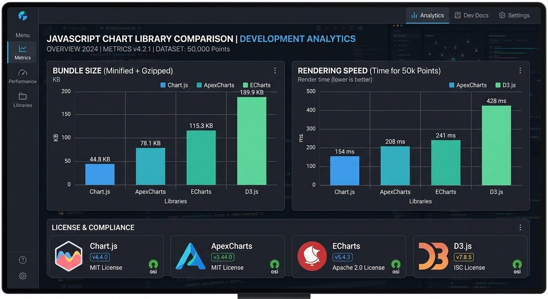
Interactive data visualization has become an essential part of modern web development. Businesses rely on dashboards to monitor performance, financial platforms use charts to display market information, and software applications transform complex datasets into understandable visual reports. Choosing the right JavaScript charting library can significantly influence development time, application performance, customization possibilities, and long-term maintenance requirements.
Highcharts remains an established option for creating interactive charts, but it is not the only solution available. Developers exploring alternatives in 2026 can consider Chart.js, Apache ECharts, D3.js, ApexCharts, Plotly.js, Recharts, and Nivo. Each JavaScript charting library offers different strengths, including rendering methods, framework compatibility, licensing conditions, accessibility capabilities, and support for advanced visualization. Understanding these differences helps development teams select tools that match their technical requirements rather than relying exclusively on popularity.
What Is a JavaScript Charting Library?
A JavaScript charting library is a software package that helps developers create data visualizations within websites and web applications.
Specifically, these tools convert structured information into graphical representations such as line charts, bar charts, pie charts, scatter plots, and more specialized visualizations.
Instead of writing every drawing operation manually, developers use predefined APIs and configuration options.
Depending on the library, charts may support tooltips, animations, zooming, filtering, legends, and user interactions.
Some libraries prioritize simple implementation.
Others, meanwhile, provide extensive customization or specialized visualization capabilities.
How JavaScript Charting Libraries Work
Generally, a charting application receives data in a structured format.
From there, the JavaScript charting library interprets the data and renders visual elements through technologies such as SVG, HTML Canvas, or other supported rendering systems.
Afterward, the application may update the chart when new information becomes available.
For example, a sales dashboard can display monthly revenue and refresh the visualization when users change the selected reporting period.
Common Chart Types
Most modern charting tools support several standard visualization formats.
- Line charts for displaying trends over time.
- Bar charts for comparing categories.
- Area charts for showing cumulative or changing values.
- Pie and doughnut charts for proportions.
- Scatter plots for examining relationships.
- Bubble charts for representing additional variables.
- Heatmaps for displaying intensity or concentration.
- Candlestick charts for financial information.
- Geographic visualizations for location-based data.
- Combination charts for displaying multiple measures.
However, not every library supports these formats directly.
In some cases, projects require plugins, extensions, or additional configuration.
Why Developers Look for Highcharts Alternatives
Highcharts provides a broad set of charting capabilities and is used in many commercial applications.
However, development teams may seek alternatives for several reasons.
For instance, these include licensing requirements, customization preferences, framework integration, bundle size, rendering performance, and project budgets.
Consequently, a different JavaScript charting library may better suit a particular application.
Licensing Considerations
Highcharts has commercial licensing requirements for many business uses.
Specifically, its exact licensing terms depend on the product and intended deployment.
Therefore, organizations should consult the official licensing documentation before using it commercially.
In contrast, some alternatives offer permissive open-source licenses.
However, not every alternative is free for every use case.
Framework Compatibility
Developers building applications with React, Vue, Angular, or other frameworks may prefer charting solutions designed for those environments.
Indeed, framework integration can influence component structure, state management, and maintenance.
Customization Requirements
Some projects require unusual visualizations or detailed control over graphical elements.
In such cases, libraries with flexible rendering APIs may be more suitable.
Application Performance
Rendering large datasets can create performance challenges.
However, performance depends on data volume, chart complexity, rendering technology, browser conditions, and implementation quality.
Overall, no JavaScript charting library is universally the fastest.
7 Best JavaScript Charting Library Alternatives to Highcharts in 2026
The following options represent established approaches to web-based data visualization.
Naturally, each has advantages and limitations.
1. Chart.js for Simple and Responsive Charts
Chart.js is a widely used open-source JavaScript charting library designed for common chart types.
Specifically, it is known for a relatively approachable configuration system and responsive chart rendering.
In terms of rendering, Chart.js uses HTML Canvas for its primary approach.
Additionally, it supports line, bar, scatter, bubble, pie, doughnut, radar, and other chart types.
Key Features of Chart.js
Important capabilities include:
- Responsive chart rendering.
- Configurable animations.
- Built-in common chart types.
- Plugin support.
- Interactive tooltips.
- Customizable scales.
- Dataset updates.
- TypeScript support.
Overall, the library can be integrated into many JavaScript applications.
Why Developers Choose Chart.js
Chart.js can be suitable for teams that need conventional charts without building a visualization system from scratch.
Moreover, its configuration approach is relatively straightforward compared with lower-level drawing libraries.
However, specialized visualizations may require plugins or additional development.
Limitations of Chart.js
Chart.js is not designed to provide every possible visualization format directly.
For example, advanced interactions or unusual layouts may require custom plugins.
Also, because it uses Canvas, developers should consider accessibility and alternative data presentation.
Best Use Cases
Overall, Chart.js is often suitable for business dashboards, reporting interfaces, administrative panels, and smaller analytics applications.
2. Apache ECharts for Feature-Rich Dashboards
Apache ECharts is an open-source JavaScript charting library developed within the Apache Software Foundation ecosystem.
Notably, it offers a broad selection of visualization types and interactive features.
In terms of rendering, ECharts supports both Canvas and SVG options.
As a result, this flexibility can be useful for different application requirements.
Key Features of Apache ECharts
ECharts supports capabilities such as:
- Standard statistical charts.
- Heatmaps.
- Tree diagrams.
- Graph visualizations.
- Geographic maps.
- Interactive legends.
- Zooming and filtering.
- Configurable tooltips.
- Multiple coordinate systems.
- Dynamic data updates.
Additionally, further capabilities may depend on extensions and configuration.
Why Developers Choose ECharts
ECharts is attractive for applications requiring many visualization types within one library.
Furthermore, it can support complex analytical dashboards without requiring developers to construct every interaction manually.
Also, the declarative configuration model can simplify chart setup.
Limitations of Apache ECharts
The extensive feature set can increase the learning effort.
Consequently, complex configurations may become difficult to maintain without consistent coding practices.
Therefore, developers should also evaluate bundle size and import strategies.
Best Use Cases
Overall, Apache ECharts is suitable for enterprise dashboards, operational monitoring, data analysis platforms, and applications requiring varied interactive visualizations.
3. D3.js for Advanced Custom Visualization
D3.js is a JavaScript library for creating data-driven documents.
Unlike many conventional charting packages, D3 provides lower-level tools for manipulating documents, scales, layouts, and visual representations.
As a result, this makes it highly flexible.
However, it generally requires more development work for standard chart components.
Key Features of D3.js
D3 provides tools for:
- Data binding.
- Scales and axes.
- SVG manipulation.
- Geographic projections.
- Hierarchical layouts.
- Transitions.
- Interactive visualization.
- Custom chart construction.
- Data transformation.
- Complex graphical relationships.
Overall, D3 is particularly useful when a project requires visualization behavior not available through conventional chart configuration APIs.
Why Developers Choose D3.js
D3 offers extensive creative control.
Because of this, developers can design specialized visual representations rather than working within predefined chart templates.
Consequently, this makes it useful for research visualization, interactive storytelling, and custom analytical interfaces.
Limitations of D3.js
D3 has a steeper learning curve than many higher-level charting tools.
In addition, developers must often implement chart components, interactions, and accessibility features themselves.
As a result, the additional flexibility can increase development time.
Best Use Cases
Overall, D3.js is well suited to custom data journalism, scientific visualization, complex interactive graphics, and specialized analytical applications.
4. ApexCharts for Modern Interactive Dashboards
ApexCharts is a charting library known for interactive dashboard features and a developer-friendly configuration approach.
In addition, it supports common chart types and integrations with popular frontend frameworks.
However, its licensing terms require careful review.
Key Features of ApexCharts
Common capabilities include:
- Line and area charts.
- Bar and column charts.
- Mixed charts.
- Radial charts.
- Interactive tooltips.
- Zooming and selection.
- Responsive configuration.
- Dynamic updates.
- Data labels.
- Export features.
Overall, exact functionality depends on the product version and licensing arrangement.
Why Developers Choose ApexCharts
ApexCharts can provide attractive interactive charts with relatively concise configuration.
Additionally, its framework integrations may be useful for teams building component-based interfaces.
Important Licensing Considerations
ApexCharts has introduced licensing conditions that can vary according to usage and organizational circumstances.
Therefore, developers should not assume that every commercial use is covered by a permissive open-source license.
Instead, before selecting ApexCharts, review the current official licensing documentation.
Best Use Cases
Overall, ApexCharts may suit business dashboards, SaaS analytics interfaces, financial reporting, and interactive web applications where its license is appropriate.
5. Plotly.js for Scientific and Analytical Visualization
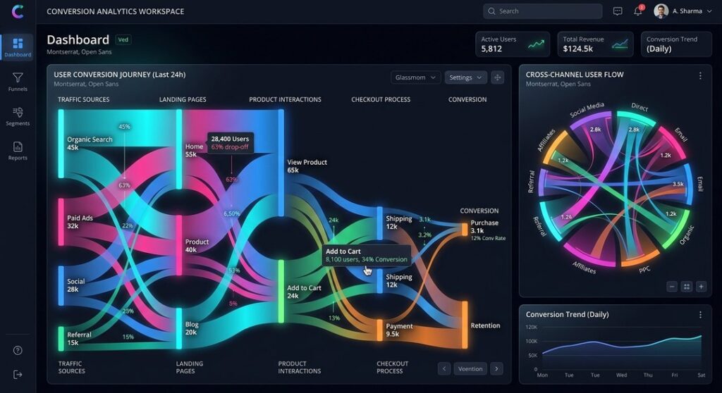
Plotly.js is an open-source JavaScript charting library with extensive support for analytical visualizations.
In particular, it is relevant for scientific, statistical, and engineering applications.
Overall, Plotly.js supports numerous chart types and interactive features.
Additionally, some visualization modes use WebGL to support particular rendering requirements.
Key Features of Plotly.js
Capabilities include:
- Scatter plots.
- Line charts.
- Statistical distributions.
- Heatmaps.
- Three-dimensional visualizations.
- Contour plots.
- Financial charts.
- Interactive zooming.
- Hover information.
- Multiple axes.
- Export functionality.
Notably, different chart types may use different rendering technologies.
Why Developers Choose Plotly.js
Plotly.js is useful when standard business charts are insufficient.
Specifically, its analytical visualization capabilities can support research dashboards and technical applications.
Limitations of Plotly.js
The complete library can be relatively large compared with lightweight alternatives.
However, Plotly provides options for more selective bundling.
In addition, complex charts may also require careful performance optimization.
Best Use Cases
Overall, Plotly.js is suitable for scientific applications, financial analysis, engineering dashboards, and advanced statistical visualization.
6. Recharts for React Applications
Recharts is a React-focused charting library built around reusable components.
Specifically, it is designed to integrate naturally with React’s component model.
Moreover, Recharts is particularly relevant for developers who want chart configuration expressed through JSX components.
Key Features of Recharts
Recharts offers:
- React component-based chart construction.
- Line charts.
- Bar charts.
- Area charts.
- Scatter charts.
- Pie charts.
- Tooltips.
- Legends.
- Responsive containers.
- Customizable axes.
- Composable chart elements.
For rendering, the library uses SVG as its primary chart output.
Why Developers Choose Recharts
React developers may find Recharts intuitive because charts are constructed using familiar component patterns.
As a result, this can make common dashboard components easier to maintain.
Limitations of Recharts
Recharts is focused on React.
Therefore, it is not a general-purpose solution for applications using other frontend frameworks.
Additionally, highly specialized visualizations may require additional customization.
Best Use Cases
Overall, Recharts is suitable for React dashboards, analytics applications, internal business tools, and component-based reporting interfaces.
7. Nivo for Customizable React Data Visualization
Nivo is another React-focused JavaScript charting library offering a broad collection of chart components.
Additionally, it provides configurable visualizations and supports multiple rendering approaches depending on the component.
Notably, Nivo is built using technologies including D3 and React.
Key Features of Nivo
Capabilities include:
- Line charts.
- Bar charts.
- Pie charts.
- Heatmaps.
- Treemaps.
- Network diagrams.
- Responsive components.
- Custom themes.
- Motion effects.
- SVG rendering.
- Canvas options for selected charts.
Overall, the available functionality varies between components.
Why Developers Choose Nivo
Nivo provides more ready-made visualization components than developers would typically receive from D3 alone.
Additionally, its theming options can help teams create consistent dashboards.
Limitations of Nivo
Because Nivo is React-focused, it is less appropriate for projects using unrelated frontend architectures.
Therefore, developers should also review the performance characteristics of individual chart types.
Best Use Cases
Overall, Nivo is suitable for React analytics products, visually customized dashboards, and applications requiring several visualization formats.
How to Choose the Best JavaScript Charting Library
The best JavaScript charting library depends on application requirements.
For example, a lightweight dashboard may need only a few conventional charts.
In contrast, a scientific application may require advanced statistical visualization.
Meanwhile, a financial platform may prioritize interactions, large datasets, and real-time updates.
Consider Your Frontend Framework
Framework compatibility is an important starting point.
Specifically, React developers may prefer Recharts or Nivo.
Meanwhile, developers using different frameworks may find Chart.js, ECharts, or Plotly.js more flexible.
Additionally, D3.js can be integrated into framework-based applications, although its direct DOM manipulation requires thoughtful implementation.
Evaluate Required Chart Types
Before choosing a library, list the visualizations the application needs.
Generally, common business charts are supported by many tools.
However, specialized charts may narrow the options.
For example, a scientific dashboard requiring three-dimensional plots may benefit from Plotly.js.
Review Licensing Requirements
Licensing should be considered early.
Indeed, a JavaScript charting library that is technically suitable may not fit an organization’s legal or commercial requirements.
Specifically, review permitted use, attribution obligations, redistribution terms, and commercial restrictions.
Consider Performance Needs
Performance should be evaluated using representative application data.
For instance, a chart that works well with 100 data points may behave differently with hundreds of thousands.
Overall, rendering technology can influence performance, but implementation details matter greatly.
Assess Accessibility
Charts should communicate information to users with different abilities.
Specifically, consider keyboard interaction, screen reader support, text alternatives, color contrast, and accessible data tables.
However, not every library provides the same accessibility capabilities.
Evaluate Maintenance and Community Support
A library’s long-term suitability depends partly on maintenance activity, documentation, and compatibility with current frameworks.
Therefore, review official repositories and release information.
Also, avoid relying solely on popularity rankings.
SVG vs Canvas vs WebGL in JavaScript Charting

Rendering technology affects how visual elements appear and interact.
SVG Rendering
Scalable Vector Graphics represents visual elements as objects in the document.
Generally, SVG can provide sharp rendering at different sizes.
Additionally, it supports DOM-based interaction and accessibility techniques.
However, large numbers of graphical elements can create performance challenges.
Canvas Rendering
HTML Canvas provides a drawing surface controlled through JavaScript.
Generally, it can be efficient for many visualization workloads.
However, individual chart elements are not represented as separate DOM nodes.
Consequently, accessibility and interaction may require additional implementation.
WebGL Rendering
WebGL uses graphics acceleration for suitable rendering workloads.
Specifically, it can support certain large or complex visualizations.
However, performance depends on hardware, browser capabilities, and implementation.
Which Rendering Method Is Best?
There is no universal winner.
Overall, SVG may be useful for interactive diagrams with manageable element counts.
Meanwhile, Canvas may suit conventional charts and larger drawing workloads.
Similarly, WebGL may help with certain high-volume or three-dimensional visualizations.
Ultimately, the correct choice depends on actual application requirements.
JavaScript Charting Library Performance in 2026
Performance comparisons require careful testing.
Generally, claims that one library is always faster than another are usually too broad.
Instead, different libraries optimize for different tasks.
Dataset Size
Rendering a few hundred points differs from displaying millions of values.
Therefore, some applications benefit from data aggregation or downsampling.
Update Frequency
Real-time dashboards may update every few seconds or more frequently.
Consequently, the update strategy can influence performance.
Browser and Device Conditions
Desktop computers and low-powered mobile devices may behave differently.
Therefore, testing should reflect the intended audience.
Chart Complexity
A basic line chart may render quickly.
In contrast, a visualization with many labels, animations, annotations, and interactive elements may require more resources.
Memory Usage
Long-running applications should monitor memory consumption.
Specifically, improper cleanup of chart instances or event listeners can create problems.
Best JavaScript Charting Library for React
React applications can use several charting solutions.
However, React-focused libraries may offer a more natural component development experience.
Recharts
Recharts uses composable React components.
Generally, it is often suitable for conventional dashboard charts.
Nivo
Nivo provides customizable React visualization components.
Additionally, it may appeal to developers seeking additional chart types and theming capabilities.
Chart.js With React
Chart.js can be integrated with React through suitable wrappers.
However, developers should verify wrapper compatibility with the current Chart.js version.
D3.js With React
D3 can provide advanced customization.
Still, developers should carefully coordinate D3 operations with React’s rendering lifecycle.
Which Should You Choose?
Recharts may be convenient for straightforward React dashboards.
Nivo, meanwhile, may be attractive for broader visualization components.
For specialized graphics, however, D3 offers flexibility.
Ultimately, the final choice depends on project requirements.
Best JavaScript Charting Library for Vue and Angular
Vue and Angular developers can use several general-purpose charting libraries.
Chart.js
Chart.js can be integrated through framework wrappers or direct application code.
Overall, it works well for many conventional charts.
Apache ECharts
ECharts provides a wide selection of chart types.
Additionally, framework integrations are available through community and third-party packages.
Plotly.js
Plotly.js may suit applications requiring technical or scientific visualizations.
ApexCharts
ApexCharts offers framework integrations, subject to current compatibility and licensing conditions.
Important Integration Considerations
Before choosing a wrapper, verify that it supports the current framework and library versions.
Also, maintenance status matters because outdated wrappers can introduce compatibility problems.
Best Highcharts Alternatives for Financial Dashboards
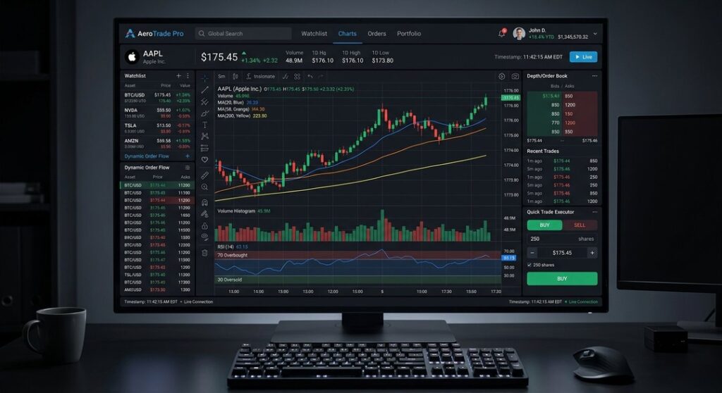
Financial dashboards often require time-series data, multiple axes, zooming, and interactive tooltips.
Additionally, some applications also need candlestick or volume charts.
Apache ECharts
ECharts supports financial visualization types, including candlestick charts.
Furthermore, its interactive configuration can be useful for market dashboards.
Plotly.js
Plotly.js provides financial chart types and interactive analytical capabilities.
ApexCharts
ApexCharts supports several chart types suitable for financial reporting.
However, developers should verify the specific features required.
D3.js
D3 can support custom financial visualizations.
However, more implementation effort may be necessary.
Financial Data Accuracy
Charting software should not be assumed to validate the accuracy of financial data.
Instead, developers must ensure correct data handling, time zones, aggregation, and calculation methods.
Best Charting Libraries for Large Datasets
Large datasets create technical challenges.
However, the number of points is only one factor.
Indeed, interactivity, update frequency, and visual complexity also matter.
Apache ECharts
ECharts includes features intended to support larger visualization workloads.
Therefore, developers should review relevant configuration options and benchmark their own data.
Plotly.js
Selected Plotly.js chart types use WebGL.
As a result, these may support particular high-volume visualization scenarios.
However, browser and hardware limitations still apply.
D3.js
D3 can be combined with different rendering technologies.
For instance, developers may implement Canvas-based or hybrid visualizations for performance-sensitive tasks.
Data Reduction Strategies
Regardless of the library, applications may benefit from:
- Aggregating data.
- Downsampling time series.
- Loading information incrementally.
- Limiting unnecessary animations.
- Reducing excessive labels.
- Caching transformed data.
- Updating only changed elements.
Overall, these techniques can sometimes improve performance more than switching libraries.
Accessibility in JavaScript Data Visualization
Accessible charts help more people understand information.
Therefore, visualizations should not rely exclusively on color or pointer-based interactions.
Color Contrast
Use sufficient contrast between chart elements and backgrounds.
Also, avoid using color as the only method of distinguishing categories.
Text Alternatives
Provide meaningful descriptions for important visualizations.
For instance, a concise summary can explain the main trend or comparison.
Accessible Data Tables
Data tables can provide an alternative way to access chart information.
Specifically, this is particularly useful when exact values matter.
Keyboard Interaction
Interactive charts should consider users who cannot operate a mouse.
Notably, support varies between libraries.
Screen Reader Compatibility
SVG and HTML structures can support accessibility features.
However, developers must implement appropriate labels and semantics.
Overall, choosing a JavaScript charting library with accessible capabilities can reduce implementation work, but testing remains essential.
Common Mistakes When Choosing a JavaScript Charting Library
Several mistakes can create unnecessary development costs.
Selecting Based Only on Popularity
A popular library may not support the required chart types or integration model.
Instead, evaluate technical requirements first.
Ignoring Licensing
Commercial restrictions can create legal and financial complications.
Therefore, review current terms before deployment.
Assuming Performance Claims Are Universal
Benchmarks depend on implementation and data.
Therefore, test representative workloads.
Overlooking Accessibility
A visually attractive chart may still be difficult for some users to understand.
Instead, plan accessibility from the beginning.
Using Excessive Animations
Animations can improve clarity when used appropriately.
However, unnecessary motion may reduce performance or accessibility.
Failing to Consider Maintenance
Libraries evolve.
Therefore, review update activity and compatibility with the application’s technology stack.
Choosing Excessively Complex Tools
D3 offers flexibility, but it may be unnecessary for simple charts.
Instead, a higher-level JavaScript charting library can reduce development effort when standard visualization types are sufficient.
How to Migrate From Highcharts to Another Library
Migrating an existing application requires planning.
Specifically, different libraries use different APIs and configuration structures.
Audit Existing Charts
List every chart type currently used.
Additionally, identify interactions, annotations, export features, and accessibility requirements.
Compare Feature Availability
Confirm whether the replacement supports necessary functionality.
In some cases, Highcharts features may require additional development in another library.
Review Data Structures
Different libraries expect different data formats.
Therefore, migration may require transforming existing datasets.
Rebuild Configuration
Chart options are not universally interchangeable.
Accordingly, developers should plan for configuration changes.
Test Performance
Benchmark important charts using realistic data.
Validate Accessibility
Ensure the migration does not remove accessibility features.
Review Licensing
Confirm that the new library’s license is appropriate for the deployment.
Open-Source vs Commercial JavaScript Charting Libraries
Open-source and commercial libraries offer different advantages.
Open-Source Benefits
Permissive open-source licenses may reduce licensing costs and provide flexibility.
Additionally, source code availability can support customization and auditing.
However, free licensing does not eliminate development or maintenance costs.
Commercial Benefits
Commercial products may provide dedicated support, specialized features, and formal service arrangements.
However, costs and restrictions vary.
Total Cost of Ownership
A realistic comparison should consider:
- Licensing fees.
- Development time.
- Training requirements.
- Integration expenses.
- Maintenance.
- Support availability.
- Migration costs.
- Long-term compatibility.
Overall, the least expensive license does not automatically produce the lowest total project cost.
Future Trends in JavaScript Charting Libraries
Data visualization continues to evolve alongside web technologies and application requirements.
More Interactive Dashboards
Applications increasingly need interactive filtering, zooming, and exploration.
However, usability should remain more important than adding unnecessary interactions.
Better Framework Integration
Component-based application development continues to influence charting APIs.
Advanced Rendering Techniques
Developers are exploring ways to improve performance through GPU acceleration and efficient data processing.
However, implementation quality remains essential.
AI-Assisted Data Analysis
AI systems may help users explore data or generate chart recommendations.
However, automated interpretations can be inaccurate.
Therefore, important conclusions should be verified.
Greater Accessibility Awareness
Accessible visualization is becoming a more important design consideration.
Accordingly, developers should continue testing charts with diverse users and assistive technologies.
Which JavaScript Charting Library Should You Choose in 2026?
The best choice depends on the application.
Chart.js is a practical option for conventional charts.
Apache ECharts, meanwhile, provides a wide range of broader visualization capabilities.
For extensive customization, D3.js offers the most flexibility.
Plotly.js, similarly, is particularly relevant for scientific and analytical applications.
Recharts and Nivo are useful options for React development.
And ApexCharts may suit interactive dashboards when its licensing conditions are appropriate.
Rather than selecting a JavaScript charting library based on a universal ranking, development teams should create a short list and test representative charts.
Ultimately, a small proof of concept can reveal integration problems, performance limitations, and missing functionality before a major commitment.
FAQ’s
1. What Is the Best JavaScript Charting Library in 2026?
The best JavaScript charting library depends on your needs. Chart.js suits simple charts, ECharts offers extensive features, and D3.js supports advanced customization.
2. Is Chart.js a Free Alternative to Highcharts?
Yes. Chart.js is available under the MIT license, making it a popular open-source alternative for many commercial and noncommercial applications.
3. Which JavaScript Charting Library Is Best for React?
Recharts and Nivo are React-focused options. Additionally, Chart.js, ECharts, and D3.js can be integrated into React applications.
4. Is D3.js Better Than Highcharts?
D3.js provides greater low-level customization, while Highcharts offers many ready-made charting features. Overall, the better choice depends on development requirements.
5. Which JavaScript Charting Library Supports Large Datasets?
Apache ECharts, Plotly.js, and custom D3-based solutions may support demanding datasets, but performance depends on rendering methods and implementation.
6. Are All Highcharts Alternatives Free for Commercial Use?
No. Licensing varies between libraries and products. Therefore, review current official terms before using any JavaScript charting library commercially.
Conclusion
Choosing the right JavaScript charting library in 2026 requires balancing functionality, performance, licensing, framework compatibility, accessibility, and long-term maintenance. Highcharts remains an established visualization platform, but alternatives such as Chart.js, Apache ECharts, D3.js, Plotly.js, ApexCharts, Recharts, and Nivo provide different approaches to creating interactive charts. Some prioritize straightforward implementation, while others offer extensive customization or specialized analytical capabilities. Overall, understanding these differences helps developers avoid unnecessary complexity and select tools that match their applications.
Indeed, the most effective JavaScript charting library is not necessarily the one offering the greatest number of features. Instead, it is the solution that supports the required visualizations, integrates reliably with the development stack, meets licensing requirements, and performs well with realistic data. Therefore, before making a final decision, developers should evaluate official documentation, test important chart types, and review accessibility and maintenance considerations. Ultimately, a thoughtful selection process can lead to clearer dashboards, more efficient development, and dependable data visualization experiences for users.
Leave a Reply