
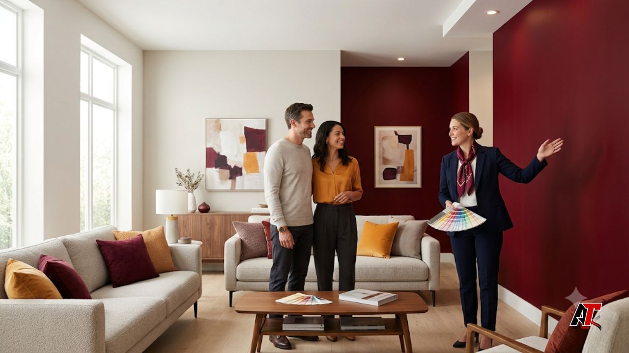
Buying a home is both a practical and emotional decision. People may compare prices, square footage, school districts, and inspection reports, but they also react to how a property makes them feel. Paint color plays a quiet but powerful role in that response. A room can appear brighter, larger, cleaner, warmer, calmer, or more dated simply because of the colors on its walls.
The psychology of color in real estate explains how different shades influence mood and perception. It does not mean one color suits every buyer. Instead, it helps sellers choose paint that supports each room while allowing visitors to imagine their own furniture and lifestyle. The goal is to create a welcoming background without removing all personality.
A thoughtful paint plan can improve listing photos, strengthen first impressions, and reduce the number of distractions buyers notice during a viewing. It can also help older rooms feel more current without the cost of a full renovation. This guide explains how buyers respond to color, which shades tend to work well in different areas, and how sellers can make safer paint choices before listing a property.
Understanding Color Psychology in Real Estate
Color psychology studies the way colors can affect emotions and behavior. In real estate, the effect is usually subtle. Buyers may not say that a soft blue wall makes them feel calm or that a dark hallway feels narrow. However, those reactions can shape the overall impression they carry from the property.
Warm colors such as beige, cream, muted terracotta, and soft tan can feel inviting. Cool colors such as light blue, pale gray, and gentle green can suggest calm, cleanliness, and space. Dark colors add depth but may close in a small room. Bright colors attract attention, so they work better on a door or small accent than across every wall.
Context matters as much as the color itself. A deep green can look refined in a bright study with natural wood, but it may look heavy in a compact bedroom with limited daylight. The best choice supports the room’s size, light, architecture, and function.
Why Paint Choices Shape First Impressions
Most buyers form an opinion within the first few moments of entering a home. Paint is one of the largest visual surfaces they see, so it strongly affects that early reaction. Fresh, coordinated walls can signal care and cleanliness. Peeling paint, uneven touch-ups, or clashing colors can suggest extra work, even when the property is structurally sound.
Color also affects how buyers read the layout. Related shades create flow, while sudden changes between strong colors can make the floor plan feel smaller or more complicated. In open-plan spaces, one consistent base color helps the living, dining, and kitchen areas feel connected.
Listing photographs add another layer. Cameras and screens may make colors appear darker, cooler, or more intense than they look in person. Mid-tone neutrals and light, balanced shades usually photograph more reliably than neon, highly saturated, or extremely dark colors.
Best Paint Colors for Different Areas of a Home
Living Rooms: Create Warmth and Flexibility
The living room often carries the strongest emotional weight because buyers picture themselves relaxing, hosting friends, and spending time with family there. Soft warm neutrals, light greige, gentle taupe, and muted beige can make the room feel comfortable without controlling the buyer’s decorating choices.
Pale green or blue-gray can also work in good natural light. Sellers should be cautious with deep red, bright orange, or strong purple across every wall because buyers may focus on repainting instead of the room itself.
Kitchens and Dining Areas: Support Cleanliness and Energy
Kitchens benefit from colors that feel fresh, clean, and active. Warm white, soft cream, pale gray, muted sage, and restrained blue can work well with common cabinet and countertop finishes. A color should complement the fixed materials rather than fight them.
Dining areas can handle slightly warmer shades because buyers associate them with conversation and comfort. However, intense yellows or reds may look dated or overly stimulating. If cabinets already have a strong color, keeping the walls quieter helps the kitchen look organized and visually larger.
Bedrooms: Encourage Calm and Rest
Bedrooms should feel peaceful. Soft blue, light green, warm gray, gentle beige, and muted lavender can create a restful mood. The main bedroom usually benefits from a refined, neutral direction that appeals to different age groups and styles.
Children’s rooms may currently contain bright colors, murals, or themed designs. Before selling, it is often wise to simplify them. A neutral or softly colored room makes it easier for buyers to imagine a nursery, guest room, office, or bedroom without feeling that immediate repainting is required.
Bathrooms: Make Small Spaces Feel Fresh
Bathrooms are usually smaller and depend heavily on lighting. Crisp white, warm white, pale blue, light gray, and soft green can create a clean, spa-like feeling. These shades often work well with tile, mirrors, chrome, brushed nickel, and white fixtures.
Very dark walls can look luxurious in a large bathroom, but they may shrink a small one. Sellers should also check the paint finish. A moisture-resistant satin or semi-gloss finish is more practical than a flat finish in areas exposed to humidity.
Exterior Walls and Front Doors: Build Curb Appeal
Exterior color creates the first emotional message before a buyer enters the property. Safe exterior choices often include warm white, soft gray, beige, taupe, or muted earth tones that suit the roof, stone, brick, and neighborhood setting.
The front door offers more freedom. Deep navy, burgundy, forest green, charcoal, or a warm golden accent can make the entrance memorable. The door color should feel intentional and polished, not disconnected from the rest of the facade.
Room-by-Room Color Guide
| Area | Helpful Color Families | Likely Buyer Response | Use Carefully |
| Living room | Greige, taupe, warm white | Comfortable and flexible | Strong red or purple |
| Kitchen | Warm white, sage, pale gray | Fresh and orderly | Highly saturated yellow |
| Bedroom | Soft blue, beige, muted green | Calm and restful | Neon or very dark tones |
| Bathroom | White, pale blue, light gray | Clean and open | Dark matte paint |
| Front door | Navy, burgundy, forest green | Memorable curb appeal | Colors unrelated to facade |
Warm Colors Versus Cool Colors
Warm and cool colors create different visual effects. Warm shades tend to move forward visually, so they can make a large room feel more intimate. Cool shades tend to recede, which can make walls seem farther away and help a smaller room feel more open.
This does not mean every small room must be blue or every large room beige. Undertones still matter. Gray may lean blue, green, purple, or brown, while white may look creamy, yellow, or cool. Compare samples beside flooring, cabinets, countertops, and other fixed finishes.
A balanced home often uses one main neutral, one supporting shade, and a limited number of accents. This approach creates consistency while still giving each space a clear purpose.
How Lighting Changes the Way Buyers See Color
Paint never exists separately from light. Natural daylight, ceiling fixtures, lamps, window direction, and even the time of day can change how a wall looks. North-facing rooms often receive cooler light, which may make blue-gray paint feel colder. South-facing rooms usually receive warmer light and can handle cooler shades more comfortably.
Artificial lighting matters too. Warm bulbs enrich cream and beige but may turn some whites yellow. Cool bulbs sharpen white and gray but can feel less welcoming. Test large samples on more than one wall during morning, afternoon, and evening.
Digital tools can help narrow the options. A well-designed color palette generator can help sellers compare related shades and build a coordinated scheme. Still, a screen preview should support physical sampling, not replace it, because screens cannot reproduce the exact light and texture of a real room.
Why Neutral Colors Work Without Feeling Boring
Neutral paint reduces visual risk and helps buyers focus on space, windows, flooring, and architecture. Neutral does not mean plain white everywhere. Greige, warm gray, sand, cream, and pale taupe can add depth while remaining widely appealing.
Choose a neutral with an undertone that suits the home. Cool gray may suit white marble and chrome, while warm greige may work better with oak floors, beige tile, or brass hardware. Repeating that undertone across connected rooms creates a finished look.
Texture can prevent a neutral home from feeling flat. Natural wood, woven fabrics, plants, stone, soft lighting, and a few controlled accents add interest without relying on strong wall color.
Using Accent Colors Strategically
Accent colors add character when used with restraint. A front door, island, powder room, or carefully selected feature wall can become a focal point. Connect the accent to an existing material, such as tile, brick, hardware, or landscaping.
Avoid adding an accent wall only because it is popular. It works best when the architecture already suggests a focal point, such as a fireplace, built-in shelving, or the wall behind a bed. A random feature wall can feel unbalanced.
The safest accent colors are often muted rather than highly saturated. Deep navy, olive green, charcoal, burgundy, or a warm golden tone can feel sophisticated when surrounded by quieter colors.
Common Paint Mistakes That Can Discourage Buyers
A common mistake is choosing colors only from personal taste. A seller may love a lime kitchen or black bedroom, but a broad market often responds better to a flexible palette. Too many unrelated colors can also make the home feel disjointed.
Poor preparation also affects buyer perception. Visible roller marks, paint on trim, mismatched touch-ups, damaged drywall, and painted-over hardware can make a fresh color look careless. Buyers often read these details as signs that other maintenance may also have been rushed.
Finally, sellers sometimes choose pure white without considering the condition of the room. Bright white can expose wall damage, uneven surfaces, and older trim. A softer white or light neutral may produce a cleaner result.
Matching Paint Choices to the Property and Market
The palette should fit the home’s style, location, and likely buyer group. A modern apartment may suit crisp white and charcoal accents. A suburban home may feel warmer with soft neutrals and greens. Coastal properties often support pale blue and sandy beige, while traditional homes may suit cream or muted navy.
Market expectations also matter. One area may favor updated neutrals, while another values historic character. Review recent listings and successful sales in the same price range. The aim is not to copy nearby properties but to understand what buyers consider suitable for that type of home.
When the property has valuable original features, paint should support them. Covering distinctive brick, wood, or period details without a clear reason may reduce character rather than improve it.
A Practical Paint Checklist Before Listing
- Walk through the property in daylight and after sunset to identify rooms that feel dark, cold, narrow, or disconnected.
- Choose a main neutral that works with the flooring, cabinets, countertops, tile, and trim.
- Test large paint samples on different walls before buying the full amount.
- Use a consistent palette in open or connected spaces to improve visual flow.
- Repair cracks, stains, holes, and peeling areas before painting.
- Select the right finish: matte or eggshell for most living areas, and moisture-resistant satin or semi-gloss for kitchens and bathrooms.
- Repaint bold children’s rooms or highly personal feature walls when they limit how buyers imagine the space.
- Review listing photographs after painting to confirm the colors appear balanced on screen.
Final Thoughts
Paint cannot change a home’s location or floor plan, but it can change how buyers experience both. The right colors improve flow, support natural light, reduce distractions, and help each room communicate its purpose. Strong paint decisions make the property feel clean, comfortable, coordinated, and easy to imagine as a future home.
The psychology of color in real estate gives sellers a practical way to prepare a property. Start with fixed materials, consider the lighting, choose a restrained palette, and test each important color in the actual space. A well-planned repaint can improve photos, viewings, and buyer confidence while protecting the home’s character.
For more practical digital marketing and content guidance, explore aelftech.com USA.
Leave a Reply