
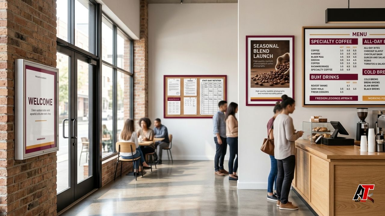
Customers and employees form opinions about a business before anyone speaks to them. A cluttered noticeboard, faded menu, crooked poster, or outdated opening-hours sign can make a capable company look careless. Organized displays create confidence, help people find information quickly, reinforce the brand, and show attention to detail.
Professional presentation does not require expensive digital screens or a large design team. It begins with a clear system: decide what belongs in each location, make important messages easy to scan, protect materials from damage, assign responsibility for updates, and remove anything that is no longer useful. This guide explains how businesses can organize notices, menus, and posters professionally across restaurants, offices, shops, clinics, schools, salons, hotels, and service locations.
Why Organized Displays Matter
A display is not decoration alone. It can guide customers, communicate prices, promote high-value services, support legal compliance, answer common questions, and reduce pressure on staff. When information is scattered, customers may miss an offer, stand in the wrong queue, or repeatedly ask for clarification. Employees may overlook an updated policy because it is buried beneath unrelated flyers.
Organization also protects brand consistency. A business may spend heavily on a logo, website, packaging, and advertising, then undermine that investment with mismatched fonts, handwritten corrections, and random paper sizes at the physical location. A structured display system connects the in-person experience with the company’s wider identity.
1. Divide the Space Into Clear Display Zones
The first step is to separate information by audience and purpose. Customer-facing promotions should not compete with staff notices, safety instructions, community flyers, delivery information, and legally required posters. Create defined zones such as entrance information, menus and pricing, current promotions, customer policies, staff communications, and permanent directional signs.
Placement should match the moment when the information is needed. Opening hours belong near the entrance. Menus should be visible before the ordering point. Collection instructions belong near the pickup area. Staff schedules and employment notices should appear in a space employees regularly use, not behind customer advertising. Clear zones reduce visual noise and make updates easier because each item has a known home.
2. Build a Strong Visual Hierarchy
People rarely read a public display from top to bottom. They scan for a headline, price, date, instruction, or call to action. Design each notice around one primary message. Use a large heading, a short supporting explanation, and a clear next step such as “Order Here,” “Book Today,” “Ask a Team Member,” or “Effective From 1 July.”
Avoid shrinking text to fit too much information. Important details should be readable from the expected viewing distance. Use short paragraphs, meaningful subheadings, bullets when appropriate, and generous spacing. High contrast is essential. The ADA Standards, for example, require visual sign characters and backgrounds to use contrasting light and dark values and non-glare finishes in covered situations. Even where a particular standard does not legally apply, the underlying principle improves everyday readability. [1]
3. Create a Consistent Brand Template System
Businesses often look disorganized because every poster is designed from scratch. Build a small set of reusable templates for notices, menus, events, promotions, temporary closures, and staff announcements. Each template should define logo position, brand colours, heading style, body font, margins, image treatment, and footer information.
Consistency makes new materials faster to produce and easier to recognize. It also prevents staff from using stretched logos, low-resolution screenshots, or colours that do not match the brand. Keep editable master files in one shared location and name them clearly. A template should be flexible enough to support different messages without changing its basic visual structure.
4. Choose the Right Frame, Board, or Display Case
Loose paper attached with tape quickly curls, fades, tears, and collects dirt. Use hardware that suits the location and frequency of updates. Snap frames work well for regularly changed indoor posters. Menu holders protect countertop information. Lockable bulletin boards are useful for shared spaces. Magnetic boards help teams change staff notices without damaging walls.
outdoor poster case can shield menus, announcements, maps, and promotions from weather and unauthorised removal. SwingFrame describes outdoor display cases with weather-resistant construction, break-resistant clear windows, locks, continuous hinges, and drainage features intended to reduce condensation. Businesses should still match the case to local exposure, mounting conditions, lighting, maintenance access, and the size of the information being displayed. [2]
5. Design Menus for Fast, Confident Decisions
A professional menu helps customers understand categories, compare options, and order without feeling overwhelmed. Group similar items together and use familiar labels. Keep item names, descriptions, prices, dietary markers, and sizes aligned consistently. Avoid long descriptions that make every dish sound identical, and do not use decorative typefaces for essential information.
Highlighting should be selective. If every item is boxed, coloured, enlarged, or marked “popular,” nothing receives priority. Use emphasis for signature items, new products, bundles, or time-limited offers. Prices should be easy to find but should not dominate the entire design. Restaurants with changing availability may combine a stable core menu with a smaller insert or updateable specials panel.
Businesses must also check the rules that apply to their location and size. In the United States, FDA menu-labelling requirements apply to certain restaurants and similar establishments that are part of chains with 20 or more locations, requiring calorie information for standard menu items and other disclosures. Smaller businesses may face different state or local requirements. [3]
6. Use Wall Displays as Marketing Assets
Walls can communicate the business story while customers wait, browse, or dine. Useful content includes awards, press coverage, customer testimonials, project photographs, staff introductions, local history, community partnerships, seasonal products, and QR codes leading to reservations or loyalty programmes.
restaurant wall decor ideas that also work as marketing tools can show how press mentions, local artwork, branded photo areas, community stories, and authentic design features strengthen recognition and encourage customers to share their visit online. A restaurant can frame a newspaper review near the waiting area or create a photo-friendly branded wall that supports organic social media exposure. [4]
7. Keep Required Notices Accurate and Separate
Compliance notices should never be treated like ordinary marketing posters. Requirements differ by country, state, sector, workforce, and business size. In the United States, the Department of Labor explains that some laws require employers to post specific notices and provides a Poster Advisor to help identify federal requirements. State requirements may apply separately. [5]
Display required notices where the intended audience can readily see and read them. Do not cover official text with promotional materials, shrink a poster below a required size, or leave outdated versions in place. Maintain a register showing the notice name, source, revision date, display location, and person responsible for checking updates. Legal materials should come from official agencies rather than companies using fear-based sales messages.
8. Make Displays Accessible to More People
Professional organization includes people with low vision, colour-vision differences, limited literacy, mobility limitations, or limited fluency in the main language. Use clear sans-serif type, strong contrast, non-glare surfaces, plain wording, and recognizable symbols. Do not communicate an important status through colour alone; combine colour with text or an icon.
Place essential information at a practical viewing height and avoid locations blocked by furniture, queues, doors, plants, or merchandise. Where a large portion of the audience speaks another language, provide translated information for high-priority instructions. Digital alternatives can help, but a QR code should not be the only way to access essential information.
9. Control Dates, Versions, and Ownership
Many displays become messy because nobody knows who owns them. Assign one role or team to approve customer-facing materials and another to manage employee notices. Every temporary poster should include a start date, end date, or review date in the file record, even when those details are not printed publicly.
Use simple file names such as “Lunch Menu – Approved – 2026-06” instead of “menu-final-new-2.” Archive superseded versions so staff do not print the wrong document. Create a monthly inspection checklist covering condition, accuracy, dates, pricing, QR codes, spelling, alignment, and frame cleanliness. Immediate removal should be required when an offer expires or a policy changes.
10. Combine Print and Digital Displays Carefully
Digital screens can rotate promotions, update pricing, show queue information, and reduce reprinting. However, constant animation, small text, rapid transitions, and excessive slides can make the message harder to absorb. Give each screen a defined purpose and enough display time for a person to read the content comfortably.
Print remains useful for permanent directions, compliance posters, detailed menus, emergency instructions, and locations where screens are impractical. The most effective approach often combines both formats: a stable printed framework for essential information and digital content for timely updates. Ensure the two channels use the same prices, dates, terminology, and branding.
11. Protect Outdoor Information From Weather and Glare
Outdoor notices face sunlight, rain, wind, dust, temperature changes, and vandalism. Use suitable printing materials, fade-resistant inks, sealed frames, secure fixings, and protective covers. Position displays so reflected sunlight or nearby lighting does not make the information unreadable. Inspect seals and drainage openings periodically.
Illumination may be necessary for evening visibility, but brightness should support reading rather than create glare. Consider the approach path and the distance from which pedestrians or drivers will view the message. A poster designed for close reading should not be expected to work as roadside signage.
12. Measure Whether the Display Is Working
Professional displays should support a business objective. Track redemptions from poster-specific offer codes, scans from unique QR codes, sales of highlighted items, questions received at the counter, and customer movement through the space. Staff observations are valuable because they reveal where people hesitate or misunderstand instructions.
Testing does not require changing the entire design. Compare one headline, call to action, image, placement, or featured offer at a time. Retain the version that improves customer action without reducing clarity. Displays should be reviewed as part of the marketing system, not left unchanged simply because the frame is still on the wall.
Common Display Mistakes to Avoid
Frequent mistakes include posting too many messages in one area, using several unrelated fonts, hiding important dates, printing low-resolution graphics, placing text over busy photographs, allowing menus to become stained, and leaving expired promotions visible. Other problems include using tape that damages walls, exposing notices to rain, and covering accessibility or safety information with decorative material.
A common strategic mistake is filling every empty wall. White space helps separate messages and creates a more confident appearance. A smaller number of well-chosen, well-maintained displays usually communicates more effectively than a crowded collection of flyers.
A Practical Organization Workflow
Begin with an audit. Photograph every display area and list each item, audience, owner, source file, date, and purpose. Remove duplicates and expired content. Next, map the zones and choose the correct hardware for each location. Create templates, approve the wording, print test copies, and check readability from the real viewing position.
After installation, schedule weekly visual checks and monthly content reviews. Clean frames, replace damaged sheets, test QR codes, confirm prices, and verify legal posters against official sources. Record major changes so multiple branches can remain consistent. A documented process turns display management from an occasional cleanup into a reliable business function.
Conclusion
Businesses organize notices, menus, and posters professionally by combining clear zones, visual hierarchy, consistent branding, suitable display hardware, accurate content, accessibility, and regular maintenance. The objective is not to make every wall look like an advertisement. It is to help each message reach the right person at the right moment.
A professional display system saves staff time, strengthens trust, supports compliance, and creates more opportunities to promote products and services. Start with the most visible customer and employee areas, simplify the content, assign ownership, and build a repeatable update routine. For more practical guidance on business presentation, technology, and digital growth, readers can explore aelftech.com.
Leave a Reply