
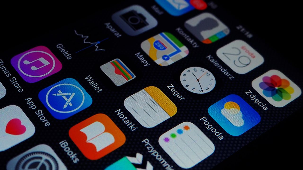
If you work in app development and design, and you have a current project that will soon be launched into the world, take a leaf out of Apple’s or Google’s book and keep it simple. In today’s day and age, when attention is arguably the most valuable commodity, simplicity is a pillar of excellent design, with a Google study showing that users form opinions about complexity in just 30 milliseconds. Users prefer simple, uncluttered designs, rating them as not only more trustworthy, but also more beautiful. The reason is simple: too many features, colors, and intricacies expose our brains to cognitive overload—a state that can tire, confuse, and impair clear thinking.
The Importance of Ease
Adults make around 35,000 decisions daily, ranging from micro-choices (such as adjusting one’s posture) to major ones (such as key features to include in new software one is creating, where to invest, or what leadership strategy to adopt). However, attention isn’t an infinite resource, and the constant need to make choices throughout the day causes decision fatigue. For this reason, executives are typically advised to schedule their most demanding, creative, or high-stakes tasks earlier in the day and to embrace simplicity as much as possible by delegating, limiting decisions, and automating routines. There’s a good reason Steve Jobs always wore a black turtleneck… it spared him the energy of deciding what to wear every day. Using simple, user-friendly apps is yet another way to reduce cognitive overload; developers should keep this in mind at the design stage.
A Key Lesson for Developers to Understand
Some of the most excellent exponents of simple design come from the world of consumer social apps—those meant to be used to interact with one’s existing social circle. These apps involve syncing contact books and inviting friends, regardless of whether their main aim is messaging or sharing interests. The developer of the consumer social app Sincerely, Zibo Gao, notes that the number one thing he is happy he already knows as a developer is the following message: “Keep it simple.” All parts of an app should be cohesive and easily digestible. App developers need to keep this message in mind at every stage, including during app updates.
The Elements of Simple App Design
Simplicity does not equate to unattractiveness, lack of visual appeal, or the absence of dynamism. Quite the contrary. Instead, it involves user-centric navigation—ensuring all navigation tools are clearly visible and well-structured so that users can get to where they wish to go with as few taps as possible. Familiar symbols (such as a magnifying glass for a search function or a cart for checkout) also make the user experience more appealing. Secondly, hierarchy must be respected, with the most important elements being the biggest, boldest, and brightest. Text should appear only in necessary containers, such as cards, so users don’t experience information overload. Designers and developers should ensure text remains readable by utilizing an appropriate amount of whitespace. Typography should be simple and limited to a maximum of two system fonts. Consistent grid systems, meanwhile, ensure everything is well-aligned and easy on the eye. Design should also be touch-friendly, with all main buttons, menus, and elements positioned in the bottom third of the screen (where they can easily be reached with one hand). Finally, there is feedback. Users should be informed about loading states, and errors should be flagged (for instance, underlined in red) so users can make pertinent corrections quickly.
The Psychology of Color
App developers can benefit from paying attention to the impact of color on cognitive overload. The general strategy is to use the 60-30-10 rule, which allocates 60% of the screen to a dominant background color, 30% to a secondary color, and 10% to a bold accent color for action buttons. The aim is to use only as many colors as are necessary to relay a message. Too many colors can distract, confuse, or overwhelm users, leading them to quit before they get into the nitty-gritty of what they can achieve with an app.
Attention is currently the most prized commodity. Users are currently overwhelmed by the number of decisions they have to make, leading to a bigger demand than ever for simple, appealing design. Simplicity does not equate to unattractiveness. It simply involves making key decisions about appearance, structure, color, and content, all with the aim of creating a friendlier user experience.
Leave a Reply